Global Health Conference
Marks & Symbols
Eco Products
Branding
Rebranding exercise for sustainable food packaging

How I Caught My Killer
Title and Interstitial design
Graphic package for Hulu original crime show

GOALS
Develop a title treatment and visual identity for a gripping new true-crime series that highlights victims solving their own cases from beyond the grave.
CONCEPT OVERVIEW
Design a compelling visual identity for Hulu’s original true-crime series How I Caught My Killer, supporting a fully integrated marketing campaign. The series features hour-long, standalone episodes, each telling a chilling real-life story.

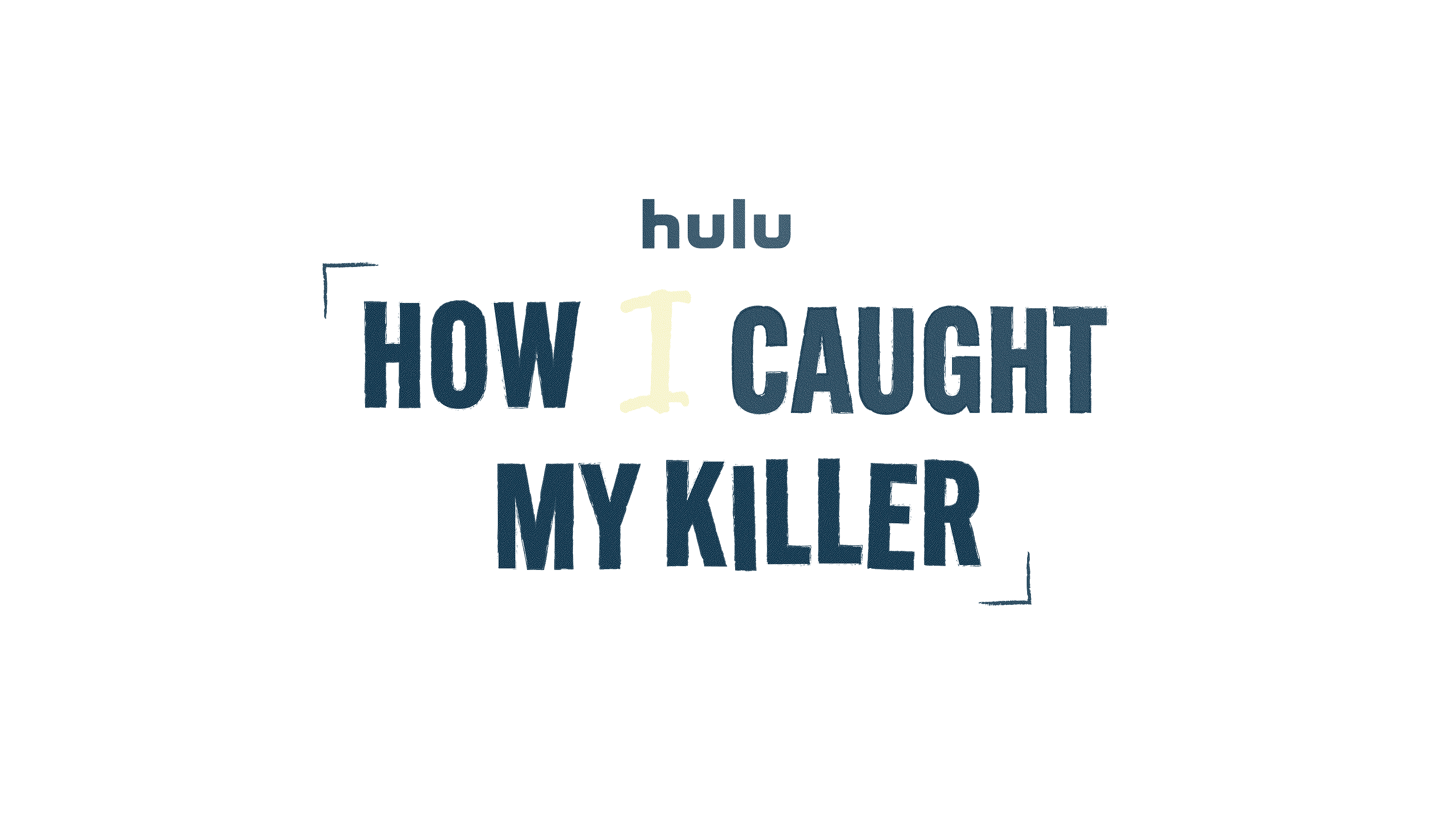
The stakeholders at Hulu requested for the title treatment to emphasize how each story was about the victims rather than their killers. The hope was to recognize their actions rather than glorifying the bad guys. I opted to accomplish this by highlighting the word "I" along with alternating handwriting typefaces.
TITLE TREATMENT


Justice is served from beyond the grave.
VISUAL ELEMENTS
Even though this was a crime show, there was a desire to create an brighter, optimistic visual identity to contrast the darkness of the content. I was inspired to create a color scheme that included pops of yellow and to showcase visual motifs that alluded to clues left by characters in the show.


